A detailed discussion of Elliott Wave analysis is beyond the scope of this FAQ; however, here’s a brief overview for those of you who are new to this approach of trading and analysis.
With more than 80 years of history, Elliott Wave analysis forms the basis of the trading strategies of millions of successful traders and investors globally. Some of the most well-known traders in the world have credited Elliott Wave Theory for their trading consistency and success.
“…the Elliott Wave theory allows one to create incredibly favorable risk/reward opportunities. I attribute a lot of my own success to the Elliott Wave approach.” – Paul Tudor Jones
In a nutshell, the Elliott Wave approach teaches us that markets, like much of life, move according to the ebb and flow of the collective sentiment of the market’s participants and that sentiment moves in regular cycles (or “waves”) that can be measured. Measuring these cycles has produced a set of well-defined patterns that are consistently identifiable in price data and usable to determine the context of a given market at multiple timeframes.
This context makes it possible to establish a backdrop of probabilities for what the market is most likely to do next. We all know that there are no magic bullets, but the Elliott Wave approach has given an edge to some of the best in the business for decades.
Elliott Waves embody intuitive and time-tested ideas. However, each Elliott Wave pattern has an associated set of rules and guidelines, which together add up to make the technique quite complex and traditionally difficult and time-consuming to master. And, once you’ve become an expert, applying the principles in practice can itself be a time-consuming and tedious process.
We developed WaveBasis to make Elliott Wave analysis smarter, faster, and more efficient. Welcome to the future of Elliott Wave.
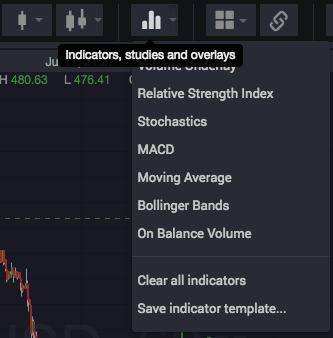
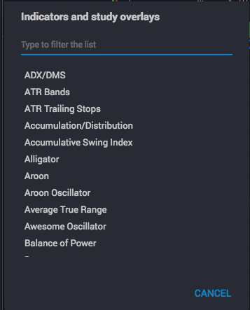
Click the indicators button in the top tool bar to open the indicator dialog, where you can either search for a specific indicator, or scroll to browse the entire collection. Click the arrow next to the indicators button to choose from a menu of popular indicators, as shown below:
There is no correct answer here. However, you’ll generally get the best results by starting counts a little before the beginning of a significant turning point rather than in the middle of a market move.
Where you start the count also depends on which phase of your analysis you’re performing. For example, if you’re beginning your analysis and trying to determine the longer-term context of a market, you might start before the beginning of the most recent long term trend. However, if you are refining your analysis to devise a more immediate price forecast, you might begin just before the last local pivot or swing point.
One way to think of choosing the beginning point of the count is to imagine that you’re going to show a range of a chart to a colleague to ask for his or her opinion. Or, perhaps you’re showing that range to another Elliott Wave analyst to ask for a wave count. In both cases, you’d probably show enough of the chart so that your colleagues can have a basic sense of “where we are” in the context of past market action. The best way to do that would be to include the last “significant” turning point in the chart range, where what is significant depends on the time frame that you are most interested in.
In these examples, WaveBasis is not much different from your colleagues. When you choose a beginning point for your automatic wave count, you decide how much of the chart you want to “show” to WaveBasis to produce the count. So, it’s best to be thoughtful about including enough of the chart range to clarify which market context you are most interested in.
After adding the Watch List gadget to one of the gadget areas in your workspace, you can create a new watch list or select an existing watch list from the gadget’s main menu as shown below.
Learn more about the Watchlist gadget on our blog.
Elliott Wave analysts understand that there is almost always more than one valid way to count a section of a chart. Given this, an important goal in supporting a trade thesis or driving toward a trade decision is assessing a given count to determine how well it complies with Elliott Wave rules and guidelines, relative to other possible count interpretations. The Auto Counts gadget makes it extremely easy to do this.
The Auto Counts gadget shows the highest probability wave counts for the most recent automatic wave count calculation for a given chart. It shows a primary count, along with up to 3 alternate wave count interpretations.
Alternate wave counts can provide supporting evidence for a primary count or trade thesis, and can also help establish probability-based risk parameters for a potential trade setup.
Click on any of the counts listed in the gadget to display them on a chart. This is a convenient way to compare counts side by side, for example, using the multi-chart layout feature as shown below, or to simply view alternate wave counts individually on a single-chart layout.
Syncing charts to the alternate wave count timeframe
At the top of the gadget you’ll see an icon next to the symbol and timeframe of the wave counts, as highlighted above. Clicking this icon will enable the feature and synchronize your current chart to the timeframe of the wave counts displayed in the gadget.
When your current chart is synced to the timeframe of the alternate counts, clicking an alternate wave count will display it on the chart at the timeframe at which the wave count was originally calculated. So if your chart is at a different timeframe, it will be switched to the original timeframe of the alternate count when the count is displayed.
For example, let’s assume your chart is at the 60-minute timeframe and the wave counts were calculated at the daily timeframe as in the picture above. When sync is enabled, clicking an alternate count will switch your chart to the daily timeframe to display the wave count.
This can be particularly convenient when reviewing longer-term alternate counts, for example, without making manual timeframe adjustments to your charts to view the next alternate count in the list.
When your current chart is not synced to the timeframe of the alternate counts, clicking an alternate wave count will display it on the chart at the current timeframe of the chart. So, the wave count will adapt to the the timeframe already displayed on your chart.
This can be particularly convenient for quickly reviewing alternate wave counts for subwave counts, for example, after you have switched your chart to a lower timeframe to refine your analysis. You can quickly review and compare each of the subwave counts at lower timeframes as you get closer to making a trading decision.
NOTE: This feature only affects what happens when you first click an alternate wave count to display it on a chart. Once the wave count has been displayed, there is no lasting effect for the chart. So, the chart will behave normally and the timeframe can be freely adjusted just like any other chart.
IMPORTANT NOTES:
1. Each time you perform an automatic wave count analysis on the currentlt selected chart, the Alternate Wave Counts gadget will display the highest probability wave counts for that chart, which will overwrite any alternate counts that were previously listed for that particular chart. If you simply change the symbol being displayed in that chart, you’ll notice that the previous alternate wave counts continue to be displayed in the gadget so that you can easily redisplay them on the current chart if you wish.
2. Alternate wave counts are not saved with charts. Each wave count listed in the gadget is independent from the others, so if you’d like to preserve a particular alternate wave count, click on it to display it in a chart, then save it, before performing a new automatic wave count analysis on that chart. When you load one of your saved charts, only the single chart that you saved will be displayed. The chart saving feature is completely independent of the Alternate Wave Counts gadget.
3. Alternate wave counts are preserved between sessions. So, if you close WaveBasis then open it later, any alternate wave counts that were previously displayed for the charts in your workspace will conveniently be restored.
4. If you are analyzing more than one market and wish to keep multiple separate lists of alternate wave counts for ongoing reference, simply run your wave counts on separate charts or workspace tabs for each symbol that you are analyzing. Then, each time you select a chart that contains a symbol’s wave count, thereby making it the current chart, the alternate wave counts for that particular wave count will be displayed.
Interpreting the listing
Each alternate wave count listed in the gadget includes some key information to help you quickly evaluate the collection of counts individually, and as a whole.
From left to right, the display indicates:
The wave count label, either “P” for “Primary Count”, or a number indicating which alternate count it is
The overall context (or bias) of the count, as reflected by the highest degree wave pattern that has not yet completed. The label is colored green for a bullish bias, and red for bearish patterns, and “Bullish” or “Bearish” will be displayed near the center of the listing.
The largest degree sub-wave that is currently underway according to the given wave count. In the example above, we see that a Bullish wave (3) is currently underway at the highest degree.
The similarity index of the wave count, expressed as a percentage. This uses our proprietary algorithm for determining how similar one count is to another count, and is an indication for how similar a given count is to the Primary Count. So, the Primary count at the top of the listing will always have a similarity index of 100%.
The similarity index can be used as a way to assess how much “agreement” there is among the highest probability counts. For example, if all or most of the alternate wave counts are very similar to the Primary Count (ie, they have a high Similarity Index), and indicate the same or similar Bullish/Bearish bias, this might be interpreted as evidence that the Primary Count indeed best captures the overall context and bias of a market over the time period that you have analyzed.
When alternate wave counts have low similarity to the Primary Count, this is usually an indication that closer inspection of the alternate wave counts might be in order. A low Similarity Index is not on its own an indication that the alternate count “disagrees” with the primary count, so the displayed Bullish/Bearish bias must also be considered.
It’s often the case that wave counts with low a Similarity index (and potentially differing bias indications) actually imply the same expected forecast, depending on the trading horizon you’re interested in. Differing wave counts that imply the same trade setup can be interpreted as confirming evidence for a trade thesis, so it’s always a good idea to visually inspect and compare the given counts by displaying them on a chart.
The Insight Combo gadget is a 3-tabbed combination of 3 of our most popular gadgets rolled into one. This is a great way to conserve space in your workspace when you want to use many gadgets at the same time.
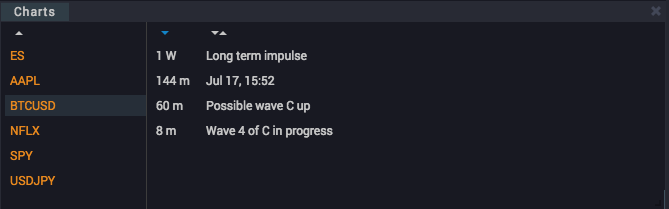
The Chart Manager keeps your charts organized by symbol/ticker and time frame, and you can assign your own title to each chart. The default title for a chart will always be the date and time that it was saved, but you can change the title simply by double-clicking on the default title and entering a new name.
Single-clicking on a chart’s title in the manager will display the chart in the currently selected chart in your workspace.
You can sort charts by name or time frame by clicking the sorting controls at the top of the time frame and chart name columns. You can also sort the symbol column by clicking the sort control at the top of that column.
You can save a chart by clicking the save icon in the chart’s top tool bar as shown below, and any drawings, wave counts, or studies that you’ve added will be saved along with the chart, for easy recall later on. You never have to worry about losing your hard work again, and long term tracking of wave counts has never been easier.
You can add the Chart Manager to your workspace, either in the right sidebar gadget area, or in the Insight gadget area at the bottom of your workspace, And, like all the other gadgets, it can be dragged, sized, and positioned in the way that you choose.
Also, like all charts in WaveBasis, saved charts remain interactively linked to the Insight Gadgets, so you can continue to inspect wave ratios, next subwave projections, and the wave guide in real time.
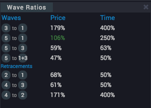
When the Wave Ratios gadget is active in your workspace, whenever you hover your mouse over a wave in the chart – or – if you hover over one of the Next Subwaves, the ratios between the various subwaves of the pattern you are inspecting are displayed in the gadget.
The ratios compares the lengths of the individual subwaves of a given wave, showing the ratios between them, as well as the ratios between the amount of time that it took to complete each subwave. This is useful for determining how well a given wave pattern fits into standard guideline expectations.
For example, a ratio indication of “C to A: 112%” means that the length of wave C was 1.12 times the length of wave A.
If any of the ratios are displayed in green, this indicates that the particular ratio is within a margin of error of the highest probability expected range, according to commonly accepted Elliott Wave guidelines.
The ratios section can be particularly useful when you’re drawing your own waves, since the pane will update in real time as you move waves around on the chart.
If you’re used to tracking this kind of thing by hand, having it done for you instantly is a great way to accelerate your workflow.
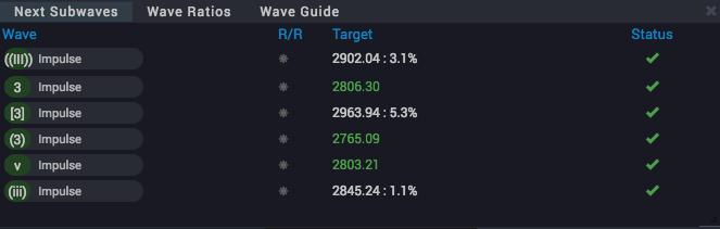
The Next Subwaves gadget is one of our most powerful and popular gadgets. It’s a concise synopsis of the context and directional bias of the current wave count, with detailed trade setup parameters, including projected price targets.
.
The gadget displays wave count projections, considering all of the incomplete waves in the count, at all timeframes (wave degrees). It gets “right to the point” when it comes to interpreting what a count is saying about what the market is statistically most likely going to do next.
This is the best way to focus in on potential low-risk trading opportunities, as each row in the table calls your attention to a potential trade setup.
The Next Subwaves list can not only help you assess whether the “pressure” on a market is currently up or down, it can also provide detailed clues regarding the path it might ultimately take moving forward.
How do I use it?
See Gadgets for information about opening and working with gadgets.
Each wave pattern on the chart that has a question mark next to one of its waves will have a corresponding row in the table.
The rows are in top-to-bottom order from higher to lower wave degrees (timeframes).
Hovering over (or touching) a row will highlight the related wave right on the chart, as well as display a green box to indicate where the minimum target area resides for that wave. This is a visual indication of where expected support (or resistance) for the given wave resides. Click the row to lock the target projection on the chart.
Hovering over the wave on the chart will highlight the corresponding row in the table.
NOTE: The Support/Resistance Smart Tool must be enabled in order to see the “green box” support and resistance price targets, see: Wave Count Enhancements
NOTE: The Next Subwaves gadget also includes a second tab which gives you an explanation of what a wave count is saying: the Wave Count Forecast gadget
IMPORTANT: The Next Subwaves gadget is completely synchronized with your current chart. This means that it works with wave counts that you draw manually as well as displaying the effect of modifications that you make to automatic wave counts.
How do I read it?
As you can see in the image above, the symbol and time frame for the wave count is shown at the top of the gadget window, along with any relevant Bias setting or Subwave count details. The columns of the table convey the following key information:
Wave
The first item in each row in the list of subwave projections shows the Elliott wave label of the next wave, along with the directional bias, green for bullish and red for bearish. This is an indication of the direction price is expected to go in order to complete the wave pattern.
Additionally, the graphic shows the type of wave pattern (“Impulse”, “Diagonal”, etc) that is most likely currently underway. The text will be colored white for automatic waves and yellow for manual waves or automatic waves that you have modified.
R/R
This is the rating for the expected profit potential (Reward/Risk) suggested by a particular wave setup. It will show a number of colored stars from zero to a maximum of 3. While 3 stars draws attention to the trade opportunities with the lowest risk and highest potential reward, all setups deserve some consideration, depending on your objectives and trading horizon.
Target
This is the projected most likely minimum price level for the end of the next wave, based on extension or retracement expectations, according to standard Elliott Wave mathematics. The Target will be colored orange when price is close to reaching the target, and green if the minimum target has already been reached. The percentage price change to reach the target is also displayed in parentheses.
Risk
This is lets you know the price level at which the trade setup will become invalid, including the equivalent risk percentage in parentheses. This information can be quite useful as a guideline for setting stop loss levels.
Status
This is an indication of whether the market has already moved far enough in the direction of the next wave to consider the setup confirmed. An orange checkmark means the setup is close to being confirmed, while a green checkmark indicates that the setup has been confirmed. A red circle with a line through it indicates that the wave projection is invalid, which usually means that the count should be recalculated to include the most recent market action.
The indications in the Next Subwaves gadget allow you to rapidly interpret a wave count and gain a sense of what a market is most likely to do next based on that count. This is a very fast way to identify potential trading opportunities.
NOTE: The target levels are not meant to serve as absolute predictions of where price will go. They simply offer a guideline, based on our research, and are common minimum expectations among Elliott Wave analysts.
Hint: Since price targets are minimum expectations, you may often see that a market has exceeded its Target for a particular wave. This, in and of itself, can be very useful information, for example when evaluating the strength of a trend.
Hint: It is also informative to see, for example, more than one trade setup share the same or very similar price targets. In the Elliott Wave world, this is generally interpreted as an important confluence, and something to pay close attention to.
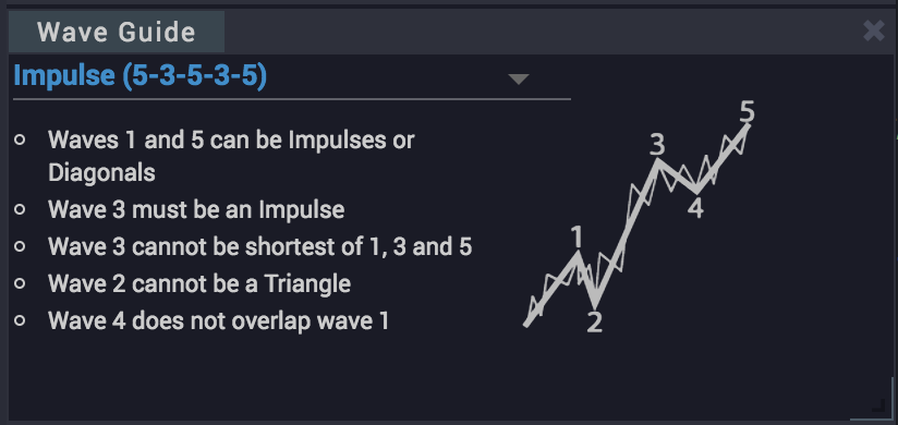
The wave guide shows you idealized diagrams of all of the standard Elliott Wave patterns, along with a list of the key rules and guidelines associated with each wave. This is a great reference for anyone looking to improve their Elliott Wave skills, or just as a memory refresher.
The guide is linked to the chart, so if you hover any wave, the details for the wave that you’re hovering over will be automatically displayed in the guide.
You can also choose any wave pattern from the dropdown menu to see the description and diagram for that particular pattern.