• Automatic Wave Counts

Reading a Wave Count

If you haven’t already completed the steps in the Quick Start, you should do that now to produce your first automatic wave count. Then come back here and read on…

Now that you’ve calculated an automatic wave count, it’s time to assess the count and evaluate any potential trading opportunities. Here are some tips to help you get started:
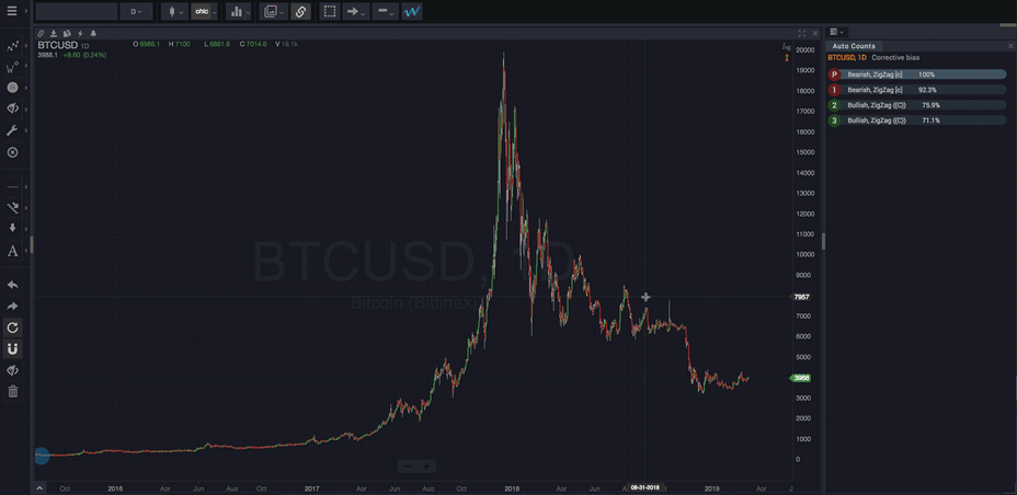
 

Wave Count Basics


  • At the high and low turning points in the chart, you’ll see both the wave label, which identifies what kind of wave has been detected, as well as…
  • The number of bars it took for each wave to complete – the number next to the wave label (if “Show # bars on waves” is enabled, see Smart Tools)
  • The waves are stacked to indicate each wave’s degree (timeframe). Wave labels further away from the price are at higher degrees (larger timeframes).
  • Hovering (or touching) a wave label will show the line connecting to the other sub-waves in the pattern. This group of sub-waves defines exactly one valid Elliott Wave pattern.
  • Hovering (or touching) a wave label also displays key details about the wave (if “Show wave info” is enabled, see Smart Tools).
  • In most cases, some waves in a count will have a question mark “?” next to them. This indicates that the wave has not yet been confirmed. In these cases, it is recommended to closely inspect the wave pattern to determine the likelihood that the placement of the questionable wave is reasonable. The best way to accomplish this is by using the Smart Support/Resistance tool to better understand how the placement of the wave compares to the highest probability price area for that particular wave.


One of many possible counts

It’s important to remember that the AutoCount that WaveBasis displays is one of potentially several (or many) possible valid counts that the pattern recognition engine has looked at and evaluated. WaveBasis has selected the count that is statistically most likely to accurately describe the current market context. In many cases, to better understand the risk associated with a trade you may be considering, and to tip the probabilities further in your favor, it is advisable to also consider alternate wave counts.


Dashed lines in counts

Sometimes the first highest-degree point in a wave count or pattern is a wave rather than the typical “zero” starting point of a wave count or pattern. Typically, it will be a wave 1 or wave 3. When you hover over a wave in one of these patterns you will see there is a dashed line connecting the waves of the pattern rather than a solid line. To see the lines you must have Show Wave Lines enabled.

This is generally an indication that the initial price move in the date range you have analyzed has been detected as a likely corrective move. However, the date range did not include enough past price history to confirm that the structure of the initial wave (the move from the “zero” point) was truly an impulsive wave.

This happens when there’s not enough information as of the starting date of the automatic wave count to confirm the true beginning of the first wave in the pattern. A wave count that starts with a corrective wave is generally a warning sign, and further investigation is advised, particularly if you are not already clear about the larger pattern context.

In these cases, WaveBasis will make an educated “guess” about what kind of wave the first wave in the pattern could be – based on the rules and active guidelines. Because it’s just a calculated guess, Smart Tools and projection targets based on these waves are not displayed, and you should consider this accordingly. You can think of this as similar to looking at a chart that has important past history hidden. In this case, you might be tempted to think of a high or low turning point as significant, but you can’t be sure until you see more of the history.

So, this is often an indication that you should consider whether the starting point of your wave count is meaningful, before making any trading decisions based on the wave count. Including more past price history will tend to produce a wave count that better captures the Elliott Wave context and includes a “zero” starting point.

Learn more about choosing a meaningful wave count starting point.


TIP: The Wave Count Forecast gadget is a great way to learn how to read and interpret Elliott Wave counts. The gadget automatically interprets wave counts for you and provides forecasts at multiple timeframes in easy-to-understand written commentary.

Read More
  • The Gadgets

Alerts Manager

The Alerts Manager gadget allows you to set new price alerts as well as pause, edit, delete, or audition existing alerts. Find the Alerts Manager in either of the gadget menus as shown below.

NOTE: The Alerts Manager gadget doesn’t have to be open in order for your alerts to trigger.


When you hover your mouse cursor over one of your alerts, a menu of actions will appear giving you the following options (from left to right as shown above)…

Clicking a symbol in the list of alerts will display a chart of that symbol in the current chart.


Pause/Resume

Use this to temporarily suspend receiving notifications when the alert triggers. Click it again to resume notifications.


Play (“Audition”)

Use this to hear what your audible alert will sound like if/when it triggers. This is useful for making sure you device’s volume is set appropriately, for example.


Edit

Click this to make changes to the alert.


Delete

Click this to cancel/delete the alert permanently.


Also see Setting Alerts and Alert When Crossed in the Modifying Waves and Patterns section.


Read More
  • Working with Charts

Setting Alerts

When you want to be alerted when a market hits a certain price point, set an alert right from the chart. Alerts can be displayed as popup windows in your workspace, or audible, including spoken word alerts.

To set an alert for a chart:

Click the Create a new alert button in the chart title bar.


A form will open with the symbol for the current chart already entered. Set the other Alert parameters to suit your taste, and click OK


The new alert is set. WaveBasis will alert you according to the settings you selected.

Learn more about other ways of setting and managing alerts in the Alerts Manager gadget section.


Read More
  • Working with Charts

Automatically Count Charts

Yet another way to streamline your analysis workflow is by enabling automatic wave count computations for a given chart. You can set up your charts so that whenever you change the symbol or resolution, an automatic wave count will be calculated automatically.

The automatic wave count will be calculated using your current automatic wave count date range and bias settings. Simply enable the “Automatically count new charts” feature from the title bar of any chart, as shown below.

Read More
  • Automatic Wave Counts

Wave Count Bias

The wave count bias setting allows you to impose your own market context on an automatic wave count.  You may sometimes have a sense of a market context before running an automatic wave count. This is particularly useful for more advanced Elliott Wave practitioners.

By default, automatic wave counts are calculated using a neutral bias. This causes the automatic wave count engine to search for all possible Elliott Wave patterns. Setting the bias will tell the automatic wave count engine to only search for a subset of the possible Elliott Wave patterns; either Corrective or Impulsive patterns.

How do I do it?


  1. Select a count bias from the bias menu in the top toolbar.
  2. Run an automatic wave count using either the blue ‘W’ or the Range Selection tool.


When should I use it?


The bias setting helps you answer specific questions like “how well does this section of the chart conform to the expected structure of a correction?”; or “how much better does this rally fit within expectations for an impulsive rally versus a corrective rally?”

For example, envision a market that has been trending upward for some time, and now the market has begun to drop in a correction. This would be an appropriate time to use the bias setting. In this scenario, you would select Corrective from the Bias menu, then run an automatic wave count on the corrective phase of the rally. This will help you get a better sense of where the market is in the context of the evolving correction. This, in turn, can help you anticipate when the correction might end and the upward trend might resume.

This particular scenario is demonstrated below…


You might also consider experimenting with bias settings as a way to compare a biased wave count to a neutral one. This can help you “build a case” for for a particular wave count interpretation. In this way, the bias setting can perform a role that is similar to that of the Alternate Wave Counts gadget. Additionally, the bias setting can be used in combination with the Alternate Wave Counts gadget as shown above.

Read More
  • Automatic Wave Counts

Before Running an Automatic Wave Count

WaveBasis will scan and label only the period of a chart you specify. So, before running an automatic wave count, you’ll need to decide upon a time range and a chart resolution that are relevant to your objectives. It’s crucial to be deliberate about these choices in order to get the best results with automatic wave counts.

NOTE: The ability to customize the date range has several benefits, including allowing you to conduct quite detailed and targeted Elliott Wave analysis very quickly as described in the upcoming sections.

Important things to keep in mind…


When setting the time range

  • AutoCount wave scans on a fixed number of bars, such as 250 or 500 bars, will alway include up to the last bar visible on the chart.
  • A fixed number of bars is a reasonable place to start to begin to get familiar with the WaveBasis platform, and will be fine for a few scenarios. However, for more serious and reliable analysis, we strongly recommend that you are specific and deliberate about exactly where your wave counts begin. Please read this important blog post to find out why.
  • For example, a setting of 250 to 750 bars is reasonable for frequent scans of a list of markets you may be monitoring. However, for more probing and comprehensive analysis of a particular market, for best results, you should be more deliberate about the Date Range setting when running AutoCounts.
  • A simple but important rule of thumb is that the date range for an AutoCount should begin with a significant market turning point. One way to make sure that a clear market turning point is included in the analysis is to select the Visible chart range or Up to the present setting in the Date Range menu, then set the zoom and scroll on your chart so that it shows only the area that you are most interested in. Also see the Automatic Pivot Detection section.


When setting the chart resolution

  • In general, AutoCounts on a smaller number of bars will run faster. So, choose a chart resolution that is appropriate for the time range you are interested in. For example, a daily chart is generally more appropriate for a count on an 18 month span of time than would be a 60 minute chart.
  • Choose a resolution that is appropriate to the question you are asking of the market, in the context of your trading style and horizon. For example, are you asking “at what price level in the very short term should I expect a low-risk entry to occur?”, or are you asking “what is the larger time frame Elliott Wave pattern context for the market?”
Read More
  • Working with Charts

Cloning a Chart

When you want get a closer look at a small chart in a multi-chart layout, or to make a copy of a chart for an alternate analysis or set of annotations, clone the chart into a new tab. Click the “Clone chart to a new tab” button in the chart title bar. A tab will be added to your workspace containing a full-sized copy of the chart, and the new tab will be selected immediately. Now you can continue your analysis seamlessly, without worrying about losing the original version of the chart.


Read More
  • Working with Charts

Saving Charts

Saving charts is a great way to track a longer term analysis or wave count over time, and makes it easy to go back and revisit an incomplete or evolving analysis without needing to keep it active in your workspace.

Once you’ve saved a chart, you can then view and manage it later using the Chart Manager gadget.

Here’s how:

  • Set a chart up the way you like it, including any drawings, wave patterns, or indicators.
  • Click the Save button in the chart title bar. 
  • The chart is saved to the Chart Manager gadget, with a default name that is the current date and time.
  • Open a gadget area and add the Chart Manager to view your saved charts.


Read More
  • Working with Charts

Selecting, Expanding, and Deleting Charts

In multi-chart layouts each chart can be individually selected so that it becomes the “current” chart. Select a chart by clicking or scrolling anywhere on the chart, or clicking the chart’s title bar. When you select a chart, a thin blue border outlines it so you can quickly determine which is the current chart.

When a chart is selected as the current chart, any chart-specific changes that you make will only be applied to that particular chart. This includes changing symbols, resolution, or chart style, as well as some drawing changes such as clearing drawings or performing an undo operation.

You can also expand any chart (set it to fullscreen mode) or remove it from the layout.

Click the fullscreen icon in right of the chart’s title bar to expand it.

Click the “X” icon in the chart title bar to delete the chart from the layout.


Click the Exit fullscreen mode button in the right of the chart’s title bar to return a fullscreen chart to its original size.


Read More
  • Working with Charts

Chart Layouts

Any tab can contain multiple charts which allows you to further customize the workspace to your needs. Tabs can contain multiple views of a specific market, for example, or multiple markets you’d like to keep in simultaneous view.

Click the Chart Layout menu and select a layout.


Once you select a layout it’s applied to the current tab. Also, chart layouts are quite flexible, since there are a number of pre-defined layouts, and individual charts can be deleted from a layout for another level of personalization.


Read More